Over the years I have implemented dozens of login forms and used thousands of them on the web. A login form mostly consists of a user/email field and a password field. It seems really basic, but there are many ways to make a login form unusable and as many ways to enhance it. In this article, I will share an approach of building and enhancing a login form.

HTTPS #
Before we start implementing, we should ensure that our site uses HTTPS and redirects every HTTP request to HTTPS. This is especially important for a site with a login form, but every website should use HTTPS for security. Using HTTP will also decrease SEO and some browsers also show a warning in the address bar if a login form is used and the site is not using HTTPS. If security, privacy and SEO are not enough to convince a client to use HTTPS, I don’t know.
Fun (not at all fun) fact: Some sites try to get around the warning by using a font-family only consisting of asterisk (*) now. If you count all the effort that went into implementing this, they could probably spend the same on moving completely to HTTPS and a SSL certificate for the next 10 years. Use HTTPS everywhere please and don’t try to play games with users.
The basic version #
Let’s start with the front-end implementation and our basic version, a HTML form with an email field, a password field and a submit button:
<form action="/login" method="post">
    <label for="email">Email</label>
    <input id="email" type="text" name="email">

    <label for="password">Password</label>
    <input id="password" type="text" name="password">

    <input type="submit" value="Login">
</form>
This will work in every browser, if the back-end is also implemented. Yes, also in Lynx. From here we start adding enhancements without breaking the basic version.

Here is a demo of the basic version and you can find the source code on Github.
Enhance with HTML #
While the basic HTML form works fine, we should enhance it by providing validation and hints.
<form action="/login" method="post">
    <div class="form__element">
        <label class="form__label" for="email">
            Email
            <span class="form__required">required</span>
        </label>
        <input class="form__input" id="email" type="text" name="email" required pattern="[^]+@[^]+[.][a-z]{2,63}$" autocomplete="email">
    </div>

    <div class="form__element">
        <label class="form__label" for="password">
            Password
            <span class="form__required">required</span>
        </label>
        <input class="form__input" id="password" type="password" name="password" required minlength="8" aria-describedby="passwordHint" autocomplete="current-password">
        <p class="form__hint" id="passwordHint">The password must be at least 8 characters long.</p>
    </div>

    <a href="/forgotPassword">Forgot password?</a>
    <input class="form__submit" type="submit" value="Login">
</form>
Let’s go through this step-by-step.
First I added <span>required</span> inside the label elements, to make it clear that the input fields are required. Additionally, I added the required attribute to the input fields. This way, a user won’t be able to submit the form in supported browsers if the value of an input is empty.

For the password field I also added an extra hint, so the users knows that the password must be at least 8 characters long. To make this accessible I use the aria-describedby attribute on the input and set the value to the id of our hint. To improve validation, I also added the minlength attribute to the password.
You may notice that I added a pattern attribute for the email field and may wonder why I didn’t use type="email". The reason is that type="email" works great in theory, but has some issues I want to avoid. The biggest problems I have with type="email" is that international email addresses are not working as you may expect and that email addresses like foo@bar are considered valid. While this is technically true, all back-end validations I ever used don’t validate such an address which means you end up with different validation on the front-end and the back-end. So, that’s the reason that I use a pattern here. I know that this regular expression is far from bulletproof, but it more or less matches my back-end validation and I am happy with it.
I also added the autocomplete attribute for both fields, so password manager will offer autocomplete. By naming the input email and password they would probably already handle this correctly, but with the autocomplete attribute we are on the safe side.
Last, I added a link to request a new password.

Here is a demo of the enhanced HTML version and you can find the source code on Github.
Enhance with CSS #
While our form now has form validation and uses proper HTML it doesn’t look appealing. So, let’s add some CSS.
.form__element {
    margin: 0 0 1em 0;
}

.form__label {
    font-size: 1.2em;
    display: block;
    margin: 0 0 0.4em 0;
}

.form__input {
    width: 100%;
    padding: 0.6em;
    font-size: 1.3em;
}

.form__required {
    float: right;
    font-size: 0.8em;
    background: #ddd;
    padding: 0.3em;
}

.form__hint {
    margin: 0;
    font-size: 1.1em;
}

.form__hint:before {
    content: "\1F6C8";
    font-size: 1.2em;
    margin: 0 0.2em 0 0;
}

.form__submit {
    background: #326f10;
    color: #fff;
    border: none;
    padding: 0.6em;
    font-size: 1.4em;
    float: right;
}
First, I added some space between the label/input groups wrapped by .form__element to make clear what groups belong together. Next, I set the label to display: block so it will be above the input. I also increased the font-size and added some spacing between it and the following input. For the input itself, I set it’s width to 100% of the width of the container and also increased font-size there and added some padding.
Next, I moved the required text to the right and gave it a light background. For the form hint about the password length I added an info icon using :before and aligned it directly under the input. Finally, I styled the submit button by giving it a remarkable background color, some padding and a big font size.
Note: I could also use Flexbox or Grid here instead of floating, but in this case it doesn’t make much sense, as it would mean more code as I would have to provide the fallback anyway.
With that in place our form now looks rather nice.

Here is a demo of the enhanced CSS version and you can find the source code on Github.
Feedback messages #
Our form now has native validation, looks good and is accessible. Let’s improve this even more with feedback messages.
The first case is that a user enters all data correctly and gets logged in. In this case, a redirect happens on the server-side to a page only accessible by logged-in users. I prefer to add a success message on top of the page so the user knows immediately that the login was successful.
<div class="message message--success" data-message>
    <p class="message__text">You have successfully logged in. Welcome back!</p>
    <button class="message__close" hidden data-closenotification>
        <span class="message__closetext">Close message</span>
    </button>
</div>
Let’s go through the HTML used for the feedback message. On the wrapper I set a data attribute, which I will later us in JavaScript, and some classes for styling it.
Next, we have the text, followed by a button. This button has the hidden attribute initially set, as the button only works when JavaScript is available and should therefore be hidden until we are sure JavaScript can be used. Browser support for the hidden attribute is pretty good, but you should add [hidden] {display: none} in CSS, so it will also be hidden in unsupported browsers.
Let’s move to the JavaScript part:
// cut the mustard

if('querySelector' in document) {

    // get all messages
    var messageComponents = document.querySelectorAll("[data-message]");

    // if at least one message is in the DOM
    if (messageComponents.length > 0) {
        // loop over each message
        [].forEach.call(messageComponents, function (message) {
            var messageButton = message.querySelector("[data-closenotification]");
            // show the close button
            messageButton.removeAttribute('hidden');

            // on click hide the message
            messageButton.addEventListener("click", function () {
                this.parentElement.hidden = true;
            });
        });
    }
}
First, I added a simple Cut the mustard test to ensure browsers not knowing about querySelector won’t execute the JavaScript inside. Next, I used querySelectorAll to get all messages, followed by a check to ensure at least one message is present on the site. After that, I used a loop to go through every message one by one. Therein the hidden attribute gets removed to show it to the user. The following eventListener makes sure to hide the complete message after clicking the close button.

There can also be an authentication error, in which case we can also use the same markup as for the success message, but add role=”alertdialog” and aria-labelledby to give the dialog an accessible name.
<div role="alertdialog" aria-labelledby="passwordError" class="message message--error" data-message>
    <p class="message__text" id="passwordError">The provided password doesn't match!</p>
    <button class="message__close" hidden data-closenotification>
        <span class="message__closetext">Close message</span>
    </button>
</div>
The next case is showing inline validation errors. While we already use native validation, it all happens on the client-side and can therefore easily be altered by a user. So, we should plan for this and handle validation errors if the back-end catches them.
<div class="form__element has-error">
    <label class="form__label" for="email">
        Email
        <span class="form__required">required</span>
    </label>
    <input class="form__input" id="email" type="text" name="email" aria-describedby="errorEmail" required pattern="[^]+@[^]+[.][a-z]{2,63}$" autocomplete="email">
    <p role="alert" class="form__error" id="errorEmail">Please use a valid email address.</p>
</div>
On the server-side I check if there is a validation error and if yes, then show the alert message in the HTML. If you are curious, here is how this can be done using Node.js and Pug.
On the error message we set role=”alert”, and on the input we use aria-describedby with the id of the error message to connect them.
With this in place, a user will always get notified when an error occurs, no matter what browser they are using or what way they find to change the client-side code.
Here is a demo showing a simulated validation message from the back-end and you can find the source code on Github.
Enhance client-side validation #
So far we have a nice looking form, have ensured that validation is in place on the back-end and front-end and that all is accessible and usable. However, there is always a way to enhance something. So, let’s use some JavaScript to validate inputs immediately after moving on.
// cut the mustard
var form = document.createElement('form');
if ('checkValidity' in form && 'querySelector' in document && 'classList' in document.documentElement) {

    // get all inputs
    var inputs = document.querySelectorAll("[data-error]");

    if (inputs.length > 0) {

        var toggleErrorMessage = function(input, hasError) {
            var message = (input.value === '') ? input.dataset.empty : input.dataset.error;
            var oldMessage = document.getElementById("alert-" + input.name);
            var newMessage;

            if (hasError) {
                if (!oldMessage) {
                    newMessage = document.createElement("p");
                    newMessage.setAttribute('role', 'alert');
                    newMessage.classList.add('form__error');
                    newMessage.setAttribute('id', 'alert-' + input.name);
                } else {
                    newMessage = oldMessage;
                }

                newMessage.innerText = message;

                input.setAttribute('aria-describedby', 'alert-' + input.name);
                input.parentElement.appendChild(newMessage);

                input.parentElement.classList.add('has-error');
            } else {

                if (oldMessage) {
                    input.parentElement.removeChild(oldMessage);
                    input.removeAttribute('aria-describedby');
                    input.parentElement.classList.remove('has-error');
                }

            }
        };
        // loop over each input
        [].forEach.call(inputs, function(input) {

            // check validation on blur
            input.addEventListener("blur", function(event) {
                input.checkValidity();

                if (input.checkValidity()) {
                    input.classList.remove("error");
                    input.setAttribute("aria-invalid", "false");
                    toggleErrorMessage(input, false);
                } else {
                    input.classList.add("error");
                    input.setAttribute("aria-invalid", "true");
                    toggleErrorMessage(input, true);
                }
            });
        });
    }
}
Let’s go through this step-by-step.
First we have a future test to check if all needed features are supported in the browser. Next we get all input elements with the attribute data-error and add a check to ensure at least one input is present. Next is the toggleErrorMessage function we will later execute on the blur event.
In this function, I first check which message we want to show – if the value is empty we show the message defined in data-empty, else the one defined in data-error. Next, I added a reference for the oldMessage and newMessage. After that, we check if the form has an error or not by checking the hasError parameter. If there is an error, we first check if there is already an old message added. If it is not we create a new element, otherwise we will use the existing one. If it as a new message, we set role="alert", class="form__error" and the id attribute. After that, we set the text for the message element and set aria-describedby for the input field with the same value or the id of the message.
If there is no error and a message was added before, we remove the message from the DOM and also remove the aria-describedby from the input field.
Next, we loop over all inputs on the form. There we first define an eventListener for the blur event. Therein we first use checkValidity() to check validation. If no validation error is found, we remove the error class and aria-invalid attribute on the input and call toggleErrorMessage to hide the error message as described above. If there is an error, we set the error class and aria-invalid attribute and show the message.

You can read more about happier form validation from Dave Rupert. I also got the inspiration for my example above from there, so thanks Dave for writing this.
Here is a demo of the enhanced validation version and you can find the source code on Github.
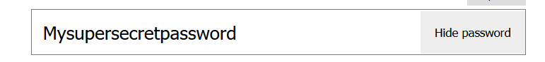
Show/Hide password #
We enhanced the validation now all the way, while still ensuring that it is still usable for everyone. As the final step of our enhancements we will integrate a pattern to show or hide the entered password.
First we modify the HTML of our login form and add a <button></button> to switch the password field between type="password" and type="text".
<div class="form__elment-inner">
    <input data-toggle-password-field class="form__input" id="password" type="password" name="password" required minlength="8" aria-describedby="passwordHint" autocomplete="current-password" data-error="Please use a password with at least 8 characters."
        data-empty="Please fill out this field">
    <button type="button" hidden aria-pressed="false" class="form__toggle-password" data-toggle-password>
        <span>Show password</span>
    </button>
</div>
On the button I set the hidden attribute to hide it initially and set aria-pressed to false. As before I also set a data attribute for a reference in JavaScript and a span element containing the text »Show password«.
Let’s move on to Javascript.
var togglePasswordButton = document.querySelector('[data-toggle-password]');

if (togglePasswordButton) {
    var togglePasswordButtonText = togglePasswordButton.querySelector('span');
    var passwordField = document.querySelector('[data-toggle-password-field]');
    togglePasswordButton.removeAttribute('hidden');


    togglePasswordButton.addEventListener('click', function() {
        var isPressed = JSON.parse(this.getAttribute('aria-pressed'));

        if (isPressed) {
            passwordField.setAttribute('type', 'password');
            this.setAttribute('aria-pressed', false);
            togglePasswordButtonText.textContent = 'Show password';
        } else {
            passwordField.setAttribute('type', 'text');
            this.setAttribute('aria-pressed', true);
            togglePasswordButtonText.textContent = 'Hide password';
        }
    });
}
First, we add a reference for our button. If there is a button, we define a variable for the span element with the text and the password input. Next, we show the button by removing the hidden attribute.
After that, we define an eventListener for the button triggered on click. There we define a variable called isPressed, which will either be true or false depending on the aria-pressed attribute. I used JSON.parse here as we need a Boolean here, while the aria-pressed attribute is a String.
If it is true (meaning the password is visually shown), we set the type attribute back to password, aria-pressed to false and change the text to »Show password«. Otherwise, we set the type attribute to text, aria-pressed to true and change the text to »Hide password«.
With that in place, the user now can visually show and hide the password value.
Here is a demo of the show/hide password version and you can find the source code on Github.
Server-side #
Until now we mostly covered the client-side. You should always remember that a user can change everything on the client-side. So, while we have client-side validation it doesn’t mean that it will prevent a user from sending invalid data. That’s why you should add the same validation we added on the client-side also on the server-side. You can find a working demo with the server-side part on Glitch.
The final login form #
As you can see there are many ways to enhance a login form, making it more accessible and more convenient to use. While I covered many things here, this is not the »best login form ever«. There are always ways to improve it and make things differently. You should however, always think about potential errors, keep it accessible, be prepared for unexpected problems and never trust client-side only.
Here is a demo of the final version and you can find the source code including the client-side Github and all code including the server-side on Glitch.