Container queries – formerly known as element queries – are one of the features I really want to see implemented in 2016. That’s why I would like to show some use cases for container queries.
Note: I use the CSS-Element-Queries Polyfill for all demos here, as it supports only min-width, min-height, max-width and max-height (which the native solution will probably also do) and is pretty well tested. I added links to other polyfills at the end of the article. Also, the syntax used by the polyfill will be different from the final solution.
Modular components #
The ideal responsive website is a system of flexible, modular components that can be repurposed to serve in multiple contexts.
Mat Marquis on A List Apart
Using media queries we need to check a module in very area of the site in different screen sizes and add a breakpoint every time the design *breaks*. By using container queries on the other hand the module is independent from the viewport size and we could define styles and container query breakpoints once based on the container size and reuse it everywhere.
Login form #
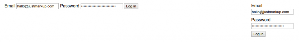
Let’s start with a demo of a Login form. This may be used in various areas of a site, be it the header, the sidebar or the main area. In this demo the input fields are among each other on narrow screens and next to each other on bigger (> 600px) screens.
form[max-width~="600px"] label,
form[max-width~="600px"] input[type="submit"] {
    margin: 0.6em 0 0.2em 0;
    display: block;
}Product items #
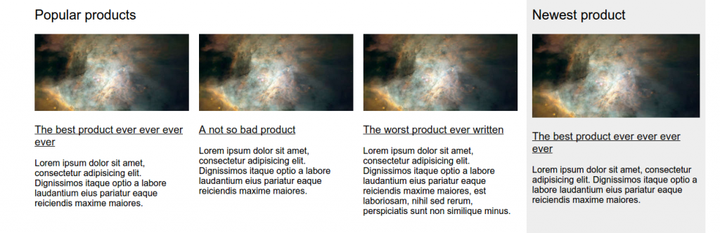
Next, we have a list of items – in this case products. On narrow screens they are shown among one another, if the container size is between 600px and 800px they are still among one another, but the image floats and the headline and text are shown alongside and if the container size is bigger than 800px the items are shown next to each other. By using container queries we can use the product list everywhere on our site and only need to define container breakpoints once – using mediaqueries we would have to use new breakpoints for every new context.
.products ul {
    margin: 0;
    padding: 0;
    list-style: none;
    display: flex;
    flex-wrap: wrap;
}

.products[min-width~="600px"] img {
    width: 50%;
    float: left;
    margin: 0 2em 2em 0;
}

.products[min-width~="800px"] ul {
    display: flex;
    flex-wrap: nowrap;
    justify-content: space-between;
}

.products[min-width~="800px"] li {
    width: 32%;
}

.products[min-width~="800px"] li:nth-child(1):nth-last-child(1) {
    width: 100%;
}

/* two items */
.products[min-width~="800px"] li:nth-child(1):nth-last-child(2),
.products[min-width~="800px"] li:nth-child(2):nth-last-child(1) {
    width: 49%;
}

.products[min-width~="800px"] img {
    width: 100%;
    float: none;
    margin: 0;
}Widgets #
Another use case will be widgets, mostly third-party widgets. Think about advertising, social media buttons and widgets, community widgets (comments, forum) or all sorts of forms. When building a third-party widget you never know in which context the code will be integrated, which makes it pretty hard to deliver a responsive version. With container queries developers will be able to react to the surrounding container and deliver a great looking version in every possible case.
Third-party iframe #
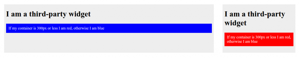
Here is an example of a third-party iframe we use in different parts of our website, in this case once in the main area and once in a sidebar. The developer of the widget here changes the background-color of an element from blue to red for narrow (=< 300px) containers.
div {
    background-color: blue;
}

div[max-width~="300px"] {
    background-color: red;
}Advertisement #

Next is an example of an advertisement, inserted into our page with JavaScript. Within the JavaScript of the ad a stylesheet gets inserted, with some styles for the ads. Using container queries the developer changes the font-size from 1em to 1.4em if the container is bigger than 500px.
.ad {
    font-size: 1em;
}

.ad[min-width~="500px"] {
    font-size: 1.4em;
}Responsive images #
Wouldn’t it be great if you could define sizes based on container sizes instead of viewport size, I thought so too, but it seems impossible. Yoav Weiss told me:
`sizes` can’t be based on layout info, since it’s needed before. EQ based images would have to suffer some delay.
Which makes sense after thinking about it, the browser don’t know the size of the container until the layout is *ready* and therefore it would take some time until the browser can decide which image should be shown.
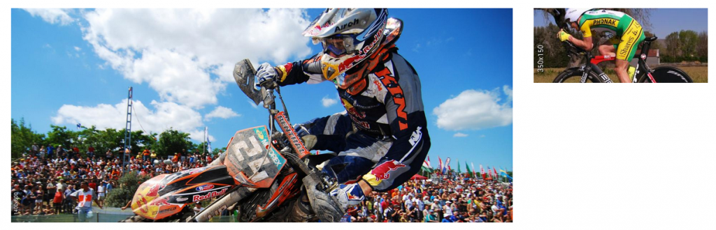
We most likely won’t get container based sizes, but one never knows. So, I made an example nevertheless using the pollyfill to show the benefits.
<div data-responsive-image>
    <img data-src="http://lorempixel.com/350/150/sports/350x150/">
    <img min-width="350" data-src="http://lorempixel.com/700/300/sports/700x300/">
    <img min-width="700" data-src="http://lorempixel.com/1400/600/sports/1400x600/">
</div>Problems and Questions #
When creating all the demos here I also had the idea for a navigation which items change from among each other to side by side if they all fit in one line. It did this by setting a container breakpoint if the nav is higher than 80px and therefore spreads across two lines. If this is the case, the nav items will all be among one another. Using the pollyfill this worked somehow, meaning you would get the right design onload and if you resize from big to small. But it won’t work when resizing from small to big, as the nav will always be higher than 80px. I don’t really know how this could be solved, but maybe you do – here is the demo?
Yes, there are a lot of questions to be asked and a lot of problems to be addressed, but I am still very optimistic we will see a first draft of container queries by the end of the year.
Demos #
Here is a list of all demos, also available on Github.
Further reading #
- Use Cases and Requirements for Element Queries (Editor’s Draft)
- CSS Containment Module Level 3
- 2014 State of Element Queries
- Being responsive to the small things
- Container Queries: Once More Unto the Breach
Pollyfills (incomplete list) #
- CSS-Element-Queries Polyfill by Marc J. Schmidt
- Elementary by Scott Jehl
- ElementQuery by Tyson Matanich
- EQ.js by Sam Richards
- Prolyfill for CSS Container Queries by Martin Auswöger