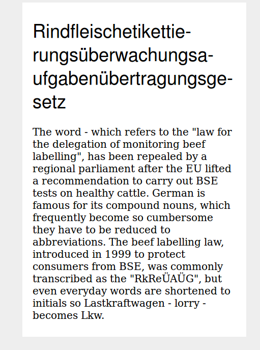
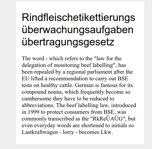
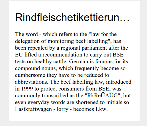
The web consists of content, content consists of words and words can be long, very long. Everyone involved with the web will sooner or later have to deal with long words.
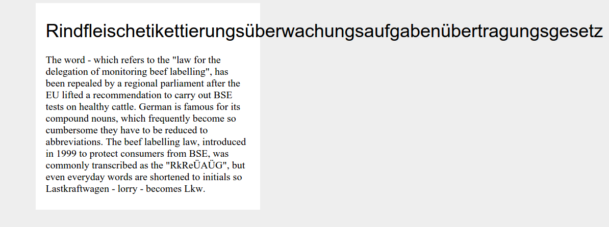
Browsing the web on my mobile device daily I see all kind of “failures” with long words – broken layouts, cropped words and situations like the one in the image above.
Hyphens #
The first solution for long words is using hyphens.
.hyphens {
    -webkit-hyphens: auto;
    -moz-hyphens: auto;
    -ms-hyphens: auto;
    hyphens: auto;
}
Browser support: CSS Hyphenation is supported in every major browser, except from all blink-based browsers (Chrome, Opera, Android) – Chromium bug. I also tested Safari 5.1 for Windows where hyphens are added but in my test words they were all on the wrong position and made no sense.
Furthermore, hyphens is language-sensitive. You have to define the lang attribute on the parent element and you should be aware that non-english languages are not supported very well across browsers.
You could also use a JavaScript library like Hyphenator.js which works with many languages and in lots of browsers. The downside is that you have to load a lot of extra JavaScript and especially for longer text it will hurt the performance.
word-break #
As browser support for hyphens isn’t really good, let’s try word-break – a CSS property to specify whether to break lines within words.
.word-break {
    -ms-word-break: break-all;
    word-break: break-all;
    word-break: break-word;
}
Browser support: CSS word-break is supported in every browser, except from Opera Mini and old presto-based Opera browsers. I also found some bugs when using word-break in combination with hyphens – more on that later.
Overflow-wrap #
The next solution is using word-wrap (overflow-wrap), another property to specify whether or not the browser may break lines within words.
.word-wrap {
    word-wrap: break-word;
    overflow-wrap: break-word;
}
Browser support: CSS overflow-wrap is supported in every (at least all I tested and listed on Can I use) browser. Note: Some browsers require the legacy name “word-wrap” (rather than “overflow-wrap”) to work.
Ellipsis #
Another option to handle long words is truncating.
.ellipsis {
    overflow:hidden;
    white-space: nowrap;
    text-overflow: ellipsis;
}
Browser support: Text-overflow is supported in every major browser.
While this technique sounds like a good fit at a first glance it comes with disadvantages. First of all it will truncate every text after one line even if you use short words which would fit perfectly and would break in more lines. Furthermore, words could be truncated in a way that the original word will get another meaning – which may be funny at best or offensive at worst.
Please, don’t use text-overflow: ellipsis at all – truncating is not a job for CSS. If you really need it do it on the server side and only truncate after full words.
Conclusion #
I tested all the examples above and combinations of them in IE7, IE8, IE9, IE10, IE11, Edge, Firefox 39 (Windows, Linux, Mac), Chrome 44 (Windows, Linux, Mac), Opera 30 (Windows, Mac), Safari 8 (Mac), Safari 5.1 (Windows), Android 5 (Nexus 6), Android 4.4 (Nexus 5), Android 2.3 (Galaxy S2), iOS 8.3 (iPhone 6), iOS 7 (iPhone 5S), iOS 6 (iPhone5), Opera Mini (Android 5), Opera Classic (Android 5), Opera Mobile (Android 5) and Windows Phone 8.1 (Lumia 930) using real devices and BrowserStack – Here is a list of all 26 browsers and their results.
When searching the web you probably will find the following solution:
.hyphenate {
    -ms-word-break: break-all;
    word-break: break-all;
    word-break: break-word;

    -webkit-hyphens: auto;
    -moz-hyphens: auto;
    hyphens: auto;
}
While this works great in most cases, I found out that in Firefox hyphens won’t work (altough supported) in combination with word-break. Also, as word-break is not supported in Opera Mini it won’t work there.
As browser support for overflow-wrap is fantastic I tested the following, using overflow-wrap and hyphens:
Final solution #
.hyphenate {
    overflow-wrap: break-word;
    word-wrap: break-word;
    -webkit-hyphens: auto;
    -ms-hyphens: auto;
    -moz-hyphens: auto;
    hyphens: auto;
}
This solution will show hyphens for every browser supporting it and will break lines in every other browser – perfect. Altough I have tested this solution in 26 different browsers I am still not sure this will work 100% – if you find any edge case please let me know.
Update 28.09.2015
Some people asked why I didn’t mention HTML soft hyphens. There are two reasons. First of all, this post is about solutions using CSS and not HTML and second and more important is that I think it’s impractical to define possible hyphens in the text itself and almost impossible for editors to do that by hand.